Many new kitchens are built with modern materials, improved storage, and updated layouts, yet they still don’t feel as open as homeowners expect. This usually has less to do with square footage and more to do with how the eye interprets the space. A kitchen can be physically large but still feel cramped if visual flow is interrupted too often. On the other hand, even a modest kitchen can feel surprisingly spacious when design choices support openness.
The key idea is that perceived space is shaped by continuity, light, and simplicity. When surfaces align, colors harmonize, and sightlines remain open, the brain reads the kitchen as larger and more breathable. The following sections explore practical, real-world strategies used in professional planning to create that effect in everyday homes.
Start With a Layout That Prioritizes Flow and Sightlines
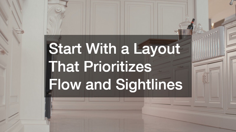
A kitchen feels bigger when movement through it is effortless and intuitive. When people can move between the sink, stove, and refrigerator without obstruction, the space naturally feels more open and functional. A strong layout removes unnecessary barriers and avoids tight corners that interrupt movement. This is why professional planning always starts with flow before aesthetics are considered.
A skilled kitchen designer often studies how people actually use the kitchen rather than just how it looks on paper. This includes cooking habits, traffic patterns, and even how often multiple people share the space at once. By understanding these behaviors, the layout can be shaped to reduce congestion and create clearer pathways.
Sightlines also play a major role. When you can stand in one area of the kitchen and see across the room without tall obstructions breaking your view, the space feels larger. Islands that are too bulky or tall cabinet walls placed in the wrong locations can quickly close off that openness.
To improve flow in practical terms, it helps to keep main pathways wide enough for comfortable movement, avoid placing tall elements directly in the center of visual lines, and ensure that work zones are logically spaced. Even small adjustments in placement can change how expansive the kitchen feels once everything is installed.
Use Visual Balance Techniques in Planning Your Space
Balance in a kitchen is not just about symmetry but about how visual weight is distributed across the room. When one side of a kitchen feels heavy and the other feels light, the space can appear uneven and smaller than it really is. A well-planned kitchen design ensures that cabinetry, appliances, and open areas work together to create a sense of stability.
One of the most effective techniques is controlling how much visual material appears at eye level. Too many upper cabinets, decorative features, or contrasting finishes can create a cluttered effect that compresses the room visually. Reducing this density helps the space feel calmer and more open.
Another important factor is consistency. Repeating shapes, aligning cabinet heights, and using uniform lines help the eye move smoothly instead of jumping from one visual element to another. When the eye moves easily, the room feels larger.
A few practical ways to improve balance include limiting strong visual contrasts to smaller areas, keeping upper sections simpler than lower storage zones, and using consistent spacing between design elements. These choices create a more relaxed visual experience that naturally expands perceived space.
Choose Surface Finishes That Reflect Light Naturally
Light is one of the most powerful tools in making a kitchen feel larger, and surface finishes determine how that light behaves. Reflective surfaces bounce brightness deeper into the room, reducing shadows and making corners feel less enclosed. This is especially important in kitchens that rely on artificial lighting or have limited natural light.
The kitchen countertop is one of the largest continuous surfaces in the space, which makes its finish particularly influential. A polished or lightly reflective surface helps distribute light, while overly dark or matte finishes can absorb it and make the room feel smaller. Choosing the right tone and texture can significantly shift the overall atmosphere.
However, reflection alone is not enough. The goal is to balance brightness with subtle texture so the kitchen does not feel sterile or overly glossy. A mix of soft sheen and natural variation tends to work best, especially when paired with coordinated cabinetry and backsplash materials.
It also helps to consider how light changes throughout the day. A surface that looks bright in morning light may behave differently in the evening, so testing samples under multiple lighting conditions is an important step before making final decisions.
Plan Smart Upgrades During Full Renovation Projects

During kitchen remodels, it is easy to focus on adding more features rather than improving spatial clarity. However, adding too many elements can quickly make a kitchen feel crowded. A better approach is to prioritize simplicity and function before layering in upgrades.
Successful remodel planning starts with identifying what can be removed or simplified. This might include reducing unnecessary cabinetry, eliminating awkward corners, or rethinking the size of an island. When the foundation is clean, every addition feels more intentional and less overwhelming.
Appliance placement is another critical factor. Poorly positioned appliances can disrupt flow and create visual clutter, even if the kitchen has high-end finishes. Aligning appliances within clear zones helps maintain a sense of order.
Some helpful planning principles include focusing on open movement paths instead of maximizing features, keeping structural elements minimal where possible, and ensuring that every addition serves a clear purpose rather than just filling space. These choices help maintain openness even after a full renovation.
Focus on Space-Efficient Cabinet and Layout Decisions
Cabinetry has one of the strongest impacts on how large a kitchen feels. Overly complex or oversized cabinet layouts can dominate the room and reduce visual openness. During kitchen remodeling, simplifying cabinet design is often one of the most effective ways to improve spatial perception.
Full-height cabinets can be useful for storage, but when used excessively, they can make walls feel heavy and enclosed. A better approach is to mix full-height storage with lighter sections or breaks that allow the eye to rest. This prevents the kitchen from feeling boxed in.
Another important strategy is reducing unnecessary variation. When too many cabinet styles, shapes, or depths are used together, the result can feel visually fragmented. Cleaner, more continuous lines help the space feel unified and larger.
It also helps to keep upper cabinetry more streamlined than lower storage. This creates a stronger sense of openness at eye level, which is where most spatial perception occurs. When the upper visual field is lighter, the entire kitchen feels more breathable.
Select Counter Materials That Enhance Continuity
Countertops can either support visual flow or interrupt it, depending on how they are chosen and installed. A granite countertop with continuous veining or a consistent pattern can help guide the eye across the kitchen, making the surface feel longer and more unified. This continuity is what contributes to a more spacious appearance.
Large, uninterrupted surfaces are especially effective because they reduce visual breaks. When countertops are cut into too many sections or paired with overly busy patterns, the eye struggles to move smoothly across the space. Keeping patterns subtle and consistent helps maintain openness.
Color also plays a major role. Lighter or mid-tone stone surfaces tend to reflect more light and blend more easily with surrounding finishes. This reduces contrast and helps the kitchen feel more cohesive overall.
Edge profiles and transitions matter as well. Cleaner, simpler edges support a modern, uninterrupted look, while overly decorative edges can add unnecessary visual noise. The goal is always to reduce distraction and maintain smooth visual flow across work surfaces.
Extend Flooring Lines to Create Seamless Visual Flow
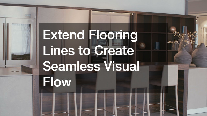
Flooring has a strong influence on how large a kitchen feels because it covers the entire base of the room. When flooring transitions are frequent or abrupt, the space can feel segmented. Using luxury vinyl plank across connected areas helps create a continuous foundation that visually stretches the kitchen.
Direction is just as important as material. When planks are laid in the longest direction of the room, they naturally elongate the visual field. This simple adjustment can make a noticeable difference in how open the kitchen feels.
It also helps to avoid unnecessary flooring changes between adjacent spaces. When the kitchen flows into dining or living areas with the same material, the boundaries between rooms soften, creating a larger perceived footprint.
Consistency in flooring allows other design elements to stand out without overwhelming the space. Instead of competing surfaces, the kitchen becomes part of a continuous environment, which enhances the feeling of openness.
Coordinate Wall and Floor Finishes for Unified Design
When wall and floor materials clash too strongly, the kitchen can feel visually fragmented. Using coordinated finishes helps unify the space and reduce the sense of separation between surfaces. Visiting tile stores can help homeowners compare textures and tones in person, which makes it easier to choose materials that work well together.
The most effective approach is to limit the number of competing patterns. When too many textures are introduced at once, the eye becomes overloaded, and the space feels smaller. Instead, selecting one or two subtle patterns and repeating them in controlled areas helps maintain balance.
Color coordination is also essential. When walls, floors, and counters share a related palette, the kitchen feels more cohesive. This does not mean everything must match exactly, but tones should complement rather than contrast sharply.
Accent tiles or bold finishes can still be used, but they should be limited to specific focal points rather than spread throughout the entire space. This keeps the overall environment calm and visually open.
Choose Appliances That Preserve Visual Simplicity
Appliances are necessary focal points in any kitchen, but they can easily become visual obstacles if not carefully integrated. A new appliance with a large or highly contrasting front panel can interrupt visual flow and make the space feel more crowded than intended.
One effective strategy is integrating appliances into cabinetry wherever possible. This helps maintain a consistent visual line across the kitchen. When appliances blend into the surrounding design, the room feels less segmented and more unified.
Finish consistency is also important. Matching appliance finishes with hardware or cabinet tones reduces contrast and helps the kitchen feel more cohesive. Stainless steel, matte black, or panel-ready options can all work depending on the overall design direction.
Appliance placement should also be considered carefully. Keeping major appliances aligned and avoiding random spacing helps maintain order. When everything has a clear place, the kitchen naturally feels more spacious and organized.
Use Color Strategy and Professional Finishing Techniques
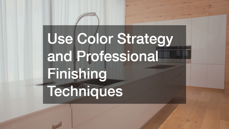
Color has a powerful psychological effect on how large a kitchen feels. Lighter tones tend to reflect more light and expand perceived space, while darker tones can make walls feel closer. However, the key is not just choosing light colors, but using them consistently across surfaces.
Working with a painter ensures that finishes are smooth and consistent, which is critical for maintaining visual continuity. Uneven paint application or inconsistent tones can break up surfaces and reduce the feeling of openness. Clean, even finishes help walls disappear into the background.
Trim and wall coordination also matter. When trim colors contrast too strongly with walls, the eye naturally stops at every boundary. Keeping these elements closely aligned allows surfaces to blend more seamlessly.
A simple and consistent color palette across the kitchen reduces visual noise and allows architectural features to stand out more clearly. This creates a calmer environment that feels significantly more open.
A kitchen does not need to be large to feel spacious. The perception of size is shaped far more by design decisions than by square footage alone. When visual flow is uninterrupted, surfaces reflect light effectively, and materials are chosen with consistency, even compact kitchens can feel open and comfortable.
The most impactful changes often come from simplification rather than addition. Reducing visual clutter, aligning surfaces, and maintaining continuity across materials allow the space to breathe. When these principles are applied together, the kitchen becomes not just more functional, but also more enjoyable to spend time in.